Data-Portfolio
Selecting a visualization to redesign
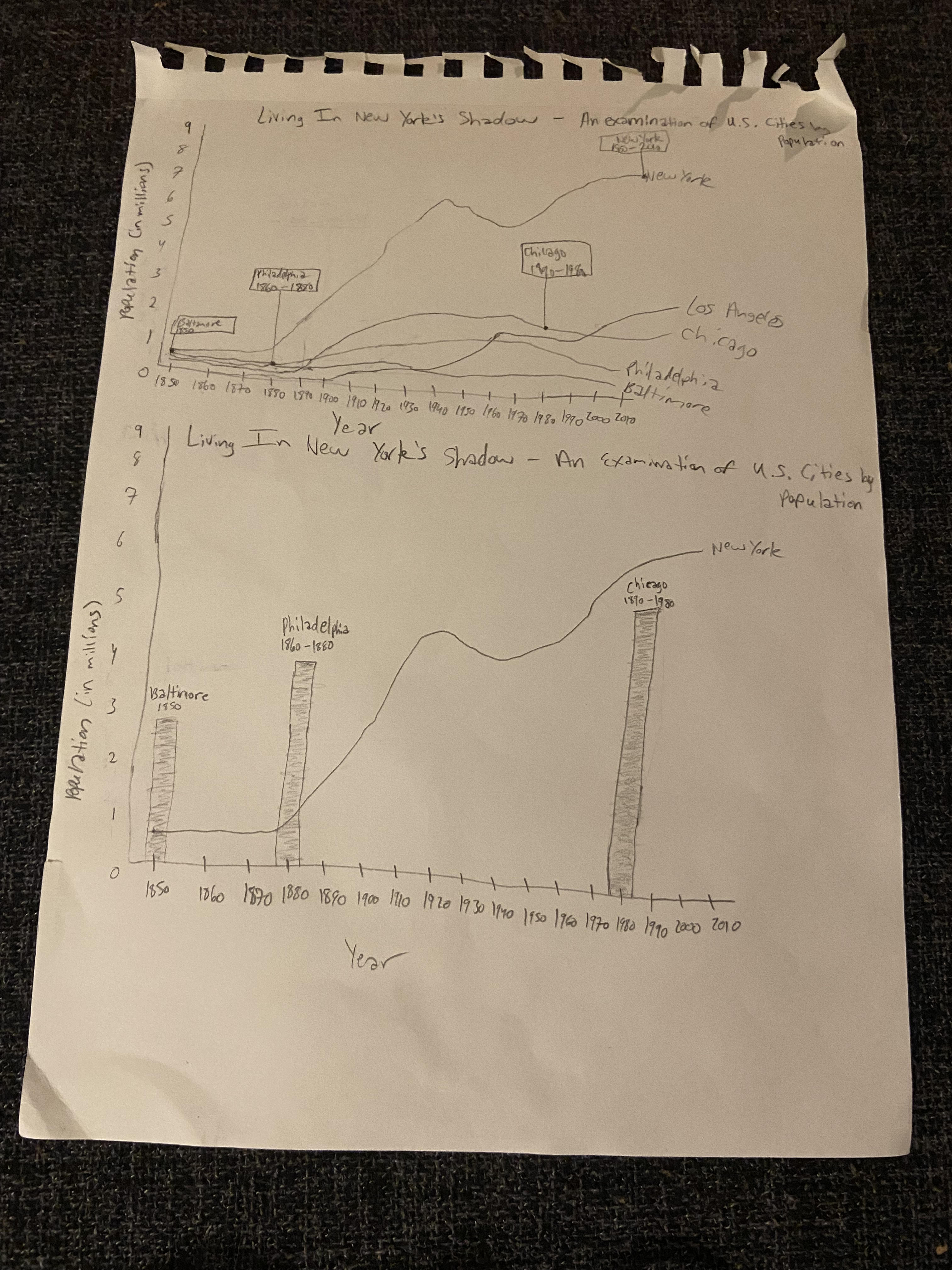
I chose the Second Cities: Keeping Pace with a Booming New York visualization because of my background in urban planning. I felt that there was a lot to learn from seeing the population trends of major U.S. cities over time in terms of how urban development might have played a part in population increases. The visualization is meant to highlight the second most populous cities after New York, but all the visual clutter was making it difficult to focus on the main takeaways. My aim for this assignment was to reprioritize the author’s intent through design.
Wireframing and testing a solution
I approached my redesign by focusing primarily on simplifying the visual. I realized that there were a lot of excessive and confusing elements that could be removed, and the use of color needed to be more intentional. I also saw an opportunity to use callout text boxes to better highlight the original designer’s intent. After I created my wireframes, I conducted two interviews for feedback on my design. The questions and responses from the interviews have been outlined below. The main takeaway for me was that I needed to make my context clearer so the viewer could focus more on the other cities and less on New York like I originally intended. Another takeaway was that rather than focusing on the change in population across the cities competing for second place, there was a primary focus on the overall trends of all the cities.
Interview 1
- Can you tell me what you think the visualization is telling you? Measuring population of cities over time
- Can you describe to me what this is telling you? New York’s population steadily rose and became the dominant city in terms of population and other cities have been catching up Measures from 1850 to 2010 -What do you notice about the other cities besides New York? They are all relatively consistent in terms of population and there are ebbs and flows between who has a higher and lower population Seems that population density dominance is alternating between cities over time with some cities having more difficulties than others -What do you notice about the elements of the chart that provide further context beyond the trends? Method of labeling makes it clear Not only labeling each individual line as a city, but also going in specific points and making reference of the population of certain cities at certain points, which makes it clear that there are dynamic shifts in population dominance Simplistic and not too much information but just enough to inform what’s going on without being overwhelming
- Is there anything you find surprising or confusing? In chart 2 - Philly looks like population is over New York, which contradicts the previous chart
- Who do you think is the intended audience for this? Someone who needs these insights to make decisions for their employment - city planner, developer (trying to understand population density for development efforts)
- Is there anything you would change or do differently? Change the bar heights to correspond with population in chart 2
Interview 2
- Can you tell me what you think the visualization is telling you? Showing that out of all the major cities in the US, New York has always had a lot more people
- Can you describe to me what this is telling you? Until 1880, there wasn’t really an increase in any city’s population, but in 1880 there was a huge jump in New York’s population -What do you notice about the other cities besides New York? They increase, but very minimally Before the 80’s, there were more cities that had higher populations than New York, but after the 80’s and onwards, New York has had the biggest population -What do you notice about the elements of the chart that provide further context beyond the trends? The second graph sampled three of the biggest cities in different time periods. Baltimore and Philly had way higher populations before the 80s
- Is there anything you find surprising or confusing? Surprising that New York had this big of a growth rate compared to the other cities and curious why there was a small decrease around the 1920s and 40s
- Who do you think is the intended audience for this? The other cities besides New York to encourage them to increase their population and catch up with New York to get the same level of prosperity
- Is there anything you would change or do differently? If the purpose is to highlight the second most populous cities, then have each city a different color and have the dots where the city is the second most populous city. And then remove the dots when the city is no longer in the lead
Final Visualization
I created a Tableau story using the data for the Second Cities: Keeping Pace with a Booming New York visualization. My design was informed by the critiques that I recevied, which emphasized the importance of highlighting the second most populous cities more intentionally. I did so by creating two story slides - one that represented the original graphic differently, and another one that represented the graphic more dynamically. The first story slide shows both New York and the second ranked cities in dot and line forms, and color was used to distinguish the reign of the second ranked city over time. The second story uses color and a dynamic graph that changes over time to immerse the audience in the gradual progression of population change. Ideally, the viewer should be equipped to identify that New York City has historically been the most populous city in the United States, and that second place in terms of population has varied consistently across Baltimore, Chicago, Los Angeles, and Philadelphia.